Determining how to build a design system for a large company means cataloging every component and pattern in meticulous detail. It’s a massive undertaking that calls for both a big-picture view and a focus on specifics. Here’s how I lead a team of 3 designers to accomplish it.
When Silicon Valley Bank set out to create an enterprise design system, the goal was to knit together a consistent look and feel for hundreds of web pages, a handful of products, and 3 design teams. Scaling the library of components and patterns depended on maintaining openness and transparency, with an emphasis on extensive documentation.
Role
I was the Lead UX Designer throughout the project cycle from holding stakeholder strategy calls, to creating the information architecture and taxonomy, all the way through development. I also collaborated with different design teams to brainstorm ideas and problem solve. The development team and I worked to consolidate and modernize our CMS.
Overview
Many companies have teams dedicated exclusively to creating and maintaining design systems. “A design system allows for consistency, going to market in a fair time and not allowing production to get stuck on customizations that are not building value,” says Madrid-based designer Alejandro Velasco. Design systems come to provide structure whenever there are many people using the same set of tools. It’s like everyone having the same language.
While a traditional style guide covers the design basics — fonts and colors, for instance — a design system has a much further reach. I had a bird’s-eye view of all the different products that SVB was using. Working in design operations also called for communicating with stakeholders throughout the company. I had to collaborate with people with very different roles within the organization, distinguishing what feedback to include in order to build the design system around the company’s needs.
Principles
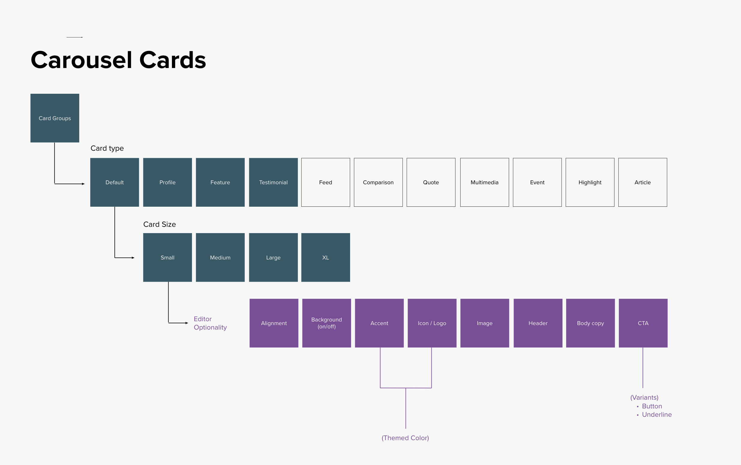
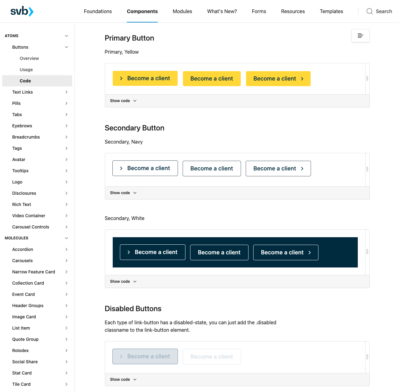
Working on the design system, I was guided by 5 key principles driving the work: Speed, Scalability, Consistency, Flexibility, and Storytelling. However, the overarching philosophy was Documentation. For every reusable element on SVB’s websites, mobile screens, large stand-alone screens, I wanted to show the life cycle of a component. That meant extensive record-keeping for all components and patterns — breadcrumbs, headers, inputs, or buttons, to name just a few.
Documentation is especially important for a design system as large as SVB’s. We wanted to make sure that if our team grew, we were able to scale. How can we make sure that everybody who joins the team can quickly go to any component and understand how it started, how it was edited, and what version they are using.
Figma
There are many tools out there for building design systems, the design team before me had started working in Sketch. When I came on I took the team through Figma and showed them how powerful of a tool it can be which in the end is where we ended up migrating all our existing designs and new moving forward.
The design library in Sketch was not scalable or in any sort of refined state when I came onto the team. Each version of the library was downloaded locally from a Sharepoint directory, so managing which version was the most recent and who the contributing designers were for each version was very tricky and poorly organized. As you'll see in the image below, there was one sketch file with all of the components scattered about on their respective pages, which was obviously difficult to make sense of what was new, old, refined, or in process.
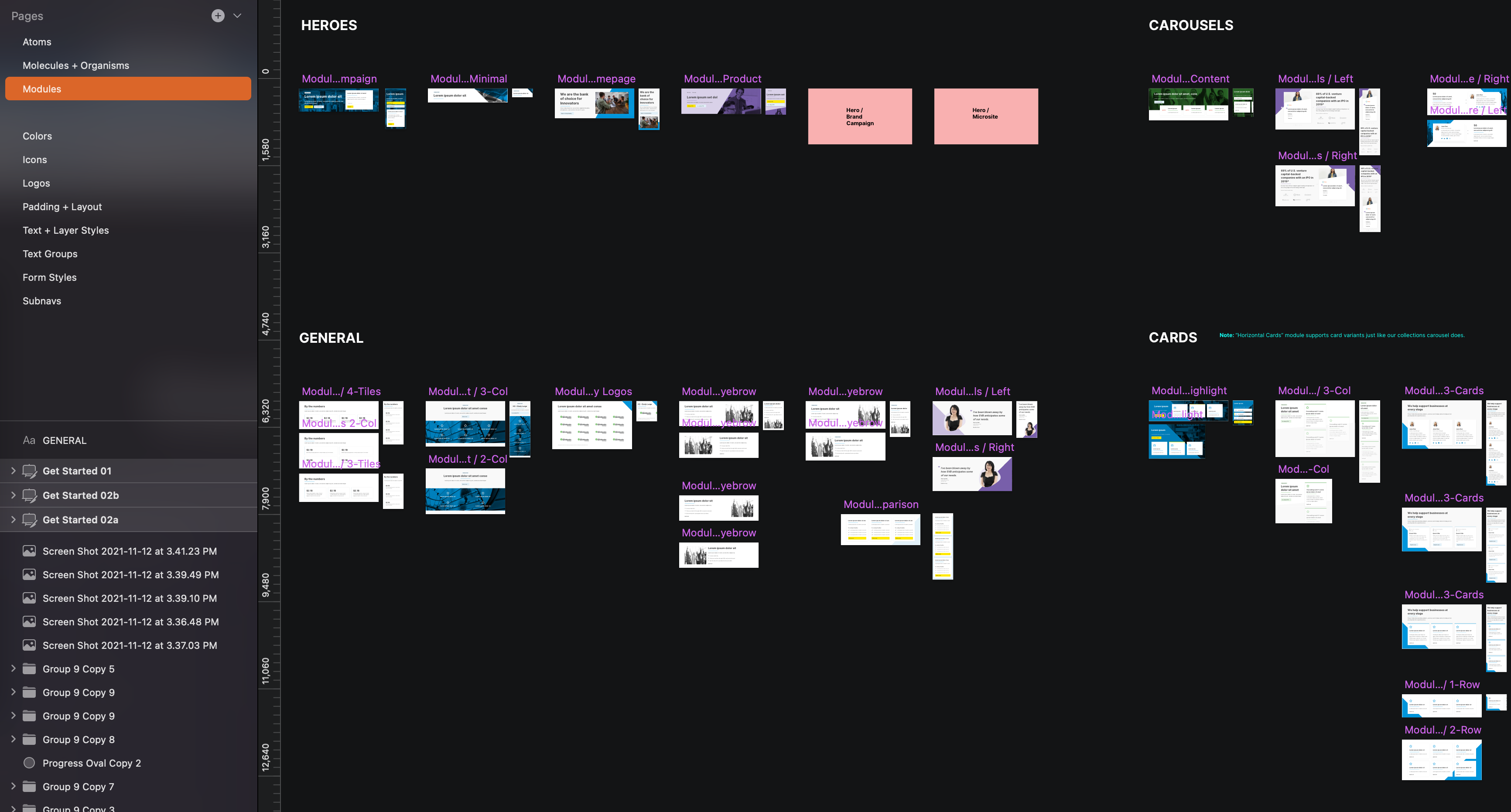
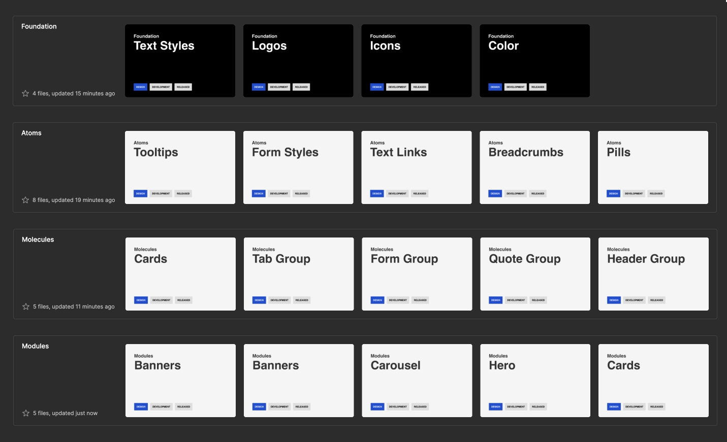
Soon after coming on board, I set out to build our design system in Figma using the atomic design methodology popularized by Brad Frost. Each component would sit within its own file, and each file would be grouped by their respective atomic element — Atoms, Molecules, Organisms, Modules — allowing for easy library syncing between files.
Hierarchy
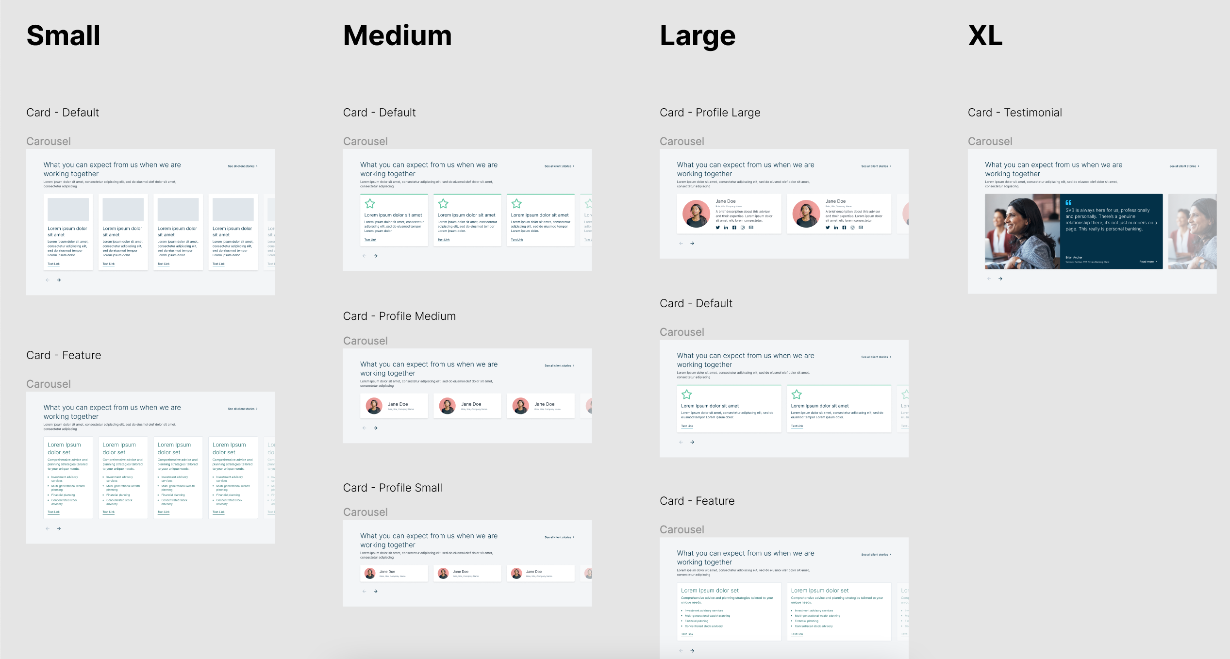
We began by setting up the design system so that the file for each component and pattern has the same page structure. The images that follow detail what's on each page.
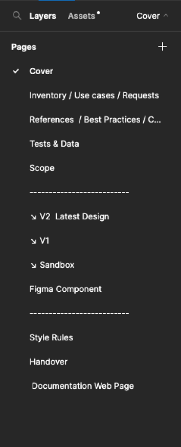
Cover
Includes the component name and what phase it’s in; design, development or released.
Inventory / Use Cases / Requests
Spells out and illustrates the many ways in which component shows up across the products.
References / Best Practices / Competitive Analysis
Include examples of Google’s Material Design and IBM’s Carbon Design System.
Tests & Data
All the data related to testing a component, including the results of A/B testing and feedback from users and stakeholders.
Scope
Make a brief out of what you have found so far. Should be a collaborative process with the product owners, developers, and designers. Sets out the rules for designing the component.
Versions
Images of the final versions of the component are found here, with the latest iteration pinned on top.
Sandbox
Enables designers to experiment with different iterations of a component or pattern directly in Figma. A playground where a designer has the freedom to do anything.
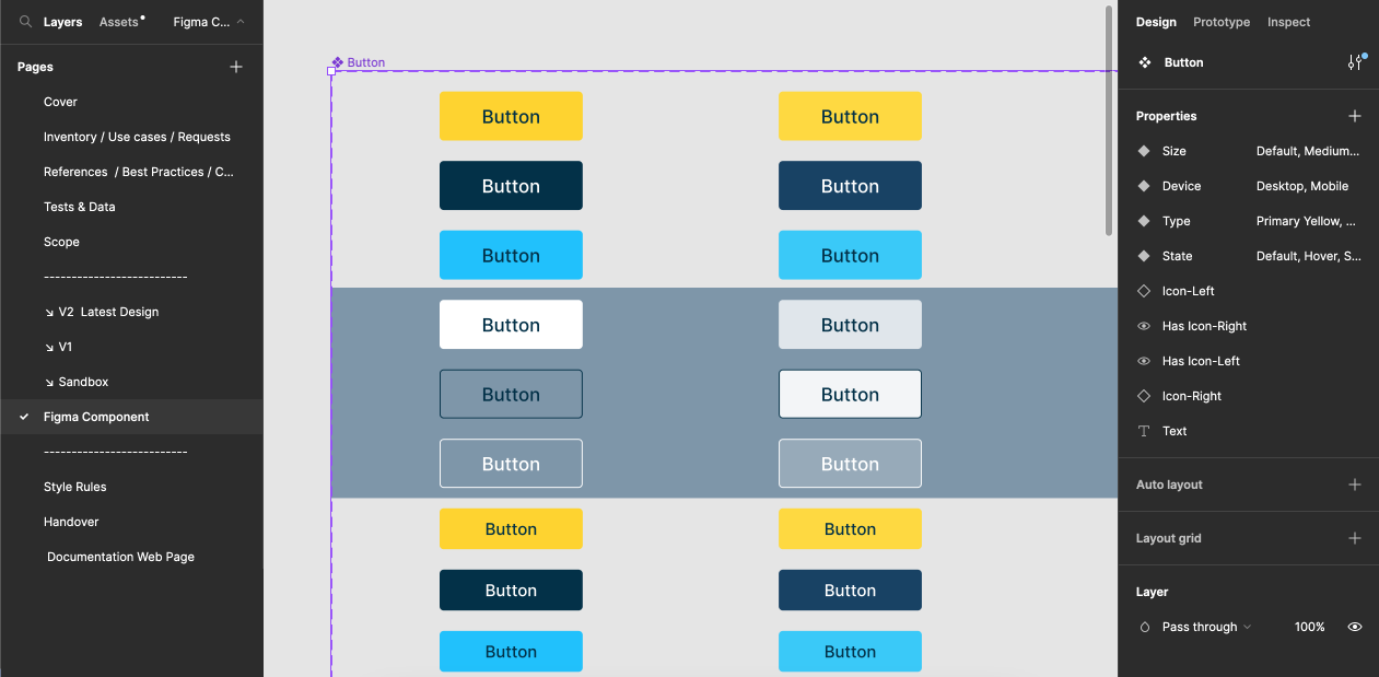
Component
Parent Component lives here. This page will be exported to the Figma design system library.
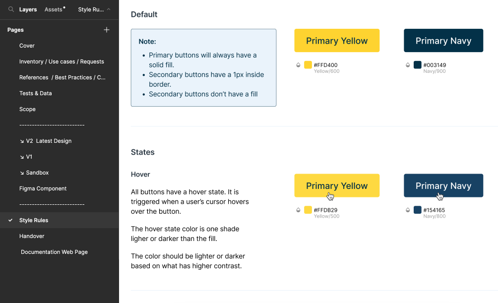
Style Rules
Tracks not only the guidelines for using the component but also any outstanding questions or information to revisit in future updates. Designers and developers create the style rules page, a kind of catch-all for elements that are not visible in the design. For example, how will the component render when you scroll down the page? Also where the team keeps track of unresolved questions or issues.
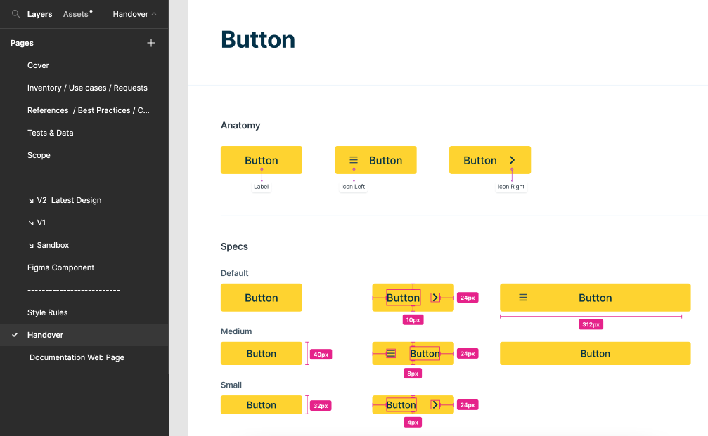
Handover
Instructions for developers on writing the code for the component. Begins with the anatomy of the component, then includes its variations. Would also include design tokens, which are pieces of platform-agnostic style information about UI elements, such as color, typeface, or font size.
Documentation Webpage
A webpage with the final design, showing how the component looks as a finished product.
Our internal and public facing documentation site was called Zeroheight. We could sync our figma files directly to their corresponding page. Along with style guidelines, best practices, and front end code, Zeroheight was an excellent tool for cross team collaboration.
What is Galileo?
Galileo is SVB’s design system for public-facing digital experiences across all channels. Aligned to our Enterprise Design System (EDS), the system consists of foundational elements, components, patterns, and working code. These core assets are driven by design principles, best practices, and design guidance that serves our users and business ecosystems to power all our digital experiences at scale.
Purpose
Drive end to end design consistency and holistic consideration across our diverse touch points, journeys, and experiences.
Approach
Modernize our design system to deliver more with less while removing the bloat and streamlining the way we drive experiences at scale in new and innovative ways through a EDS aligned design system.
Naming Conventions & Taxonomies
Problem
A bloated modules list in the CMS made it difficult for channel marketers to find and create pages, resulting in road blocks and slowed speed to market. We needed to come up with a clear way for the content strategists to use the modules in our design system. The old CMS was plagued with inconsistencies in the names of modules and components, resulting in extra time it took to create a page. The system was difficult to navigate and no module grouping.
Solution
We created a more efficient way for channel marketers, designers, developers, and outside agencies to effectively use our design system by focusing on grouping modules in a clear and intuitive way. We implemented a more intuitive system of Information Architecture by following best practices of organization and consolidation.