Role
I was the Lead UX Designer throughout the project cycle from planning and requirements gathering, strategy, wireframing, and prototyping. I also collaborated with the design and development teams to brainstorm ideas and problem solve.
Overview
The goals of this project was to increase engagement on the site, clicks on search results, and decrease drop-offs. We believed that if we optimized the search results experience, we would be able to help customers find what they're looking for.
Increasing engagement and adding an overall traffic lift to the search results experience aligned to our business OKR's.
Challenge
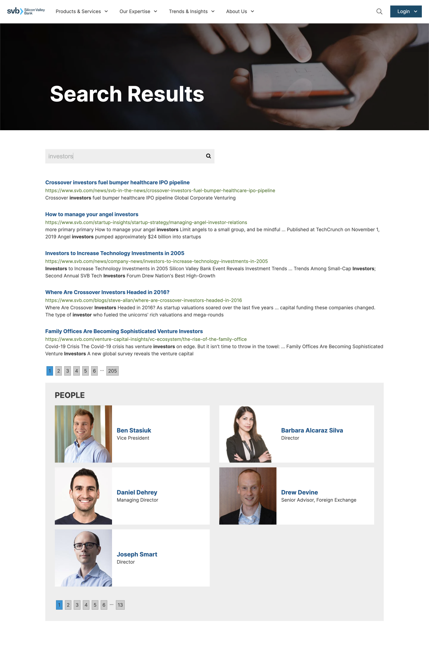
Based on our research, we knew the existing search experience had many pain points I needed to address in the redesign. Our Google Analytics data showed us there was over 30,000 unique page visits to the search results page in 2021 but the drop off rate was staggeringly high. Nearly 80% of users never clicked on a result, instead they just ended their session on svb.com. Similarly, our Crazy Egg research using a heat map on the highest searched term results pages, showed us many users never made it past the fold and either clicked the first result or closed the window.
We also knew the design needed to be updated; redefining how the search bar is interacted with, how key words and top results are displayed, as well as how user profiles are displayed.
There were technical constraints we had to navigate around as well. The CMS was built using a service called Episerver, they controlled how the search results would sort, filter, auto fill, and display each item.
Solution
I knew what our challenges were, so I set out to create an experience for the user that would promote accessibility and information finding above all else. When a user is interacting with the search function, they typically know exactly what they are looking for, but they were not able to find it right away. I see the search results page as the last chance to help a user get to where they are going.
Discover, Ideate, and Wireframe
In discovery, we learned the search results page is a great way to personalize the users experience. Using the keywords entered into the search bar, we can display the most relevant content as well as related content. The biggest pain point of the old version was that the content was not easy to absorb and needed to be easily scannable. We needed to find a balance of form and function.
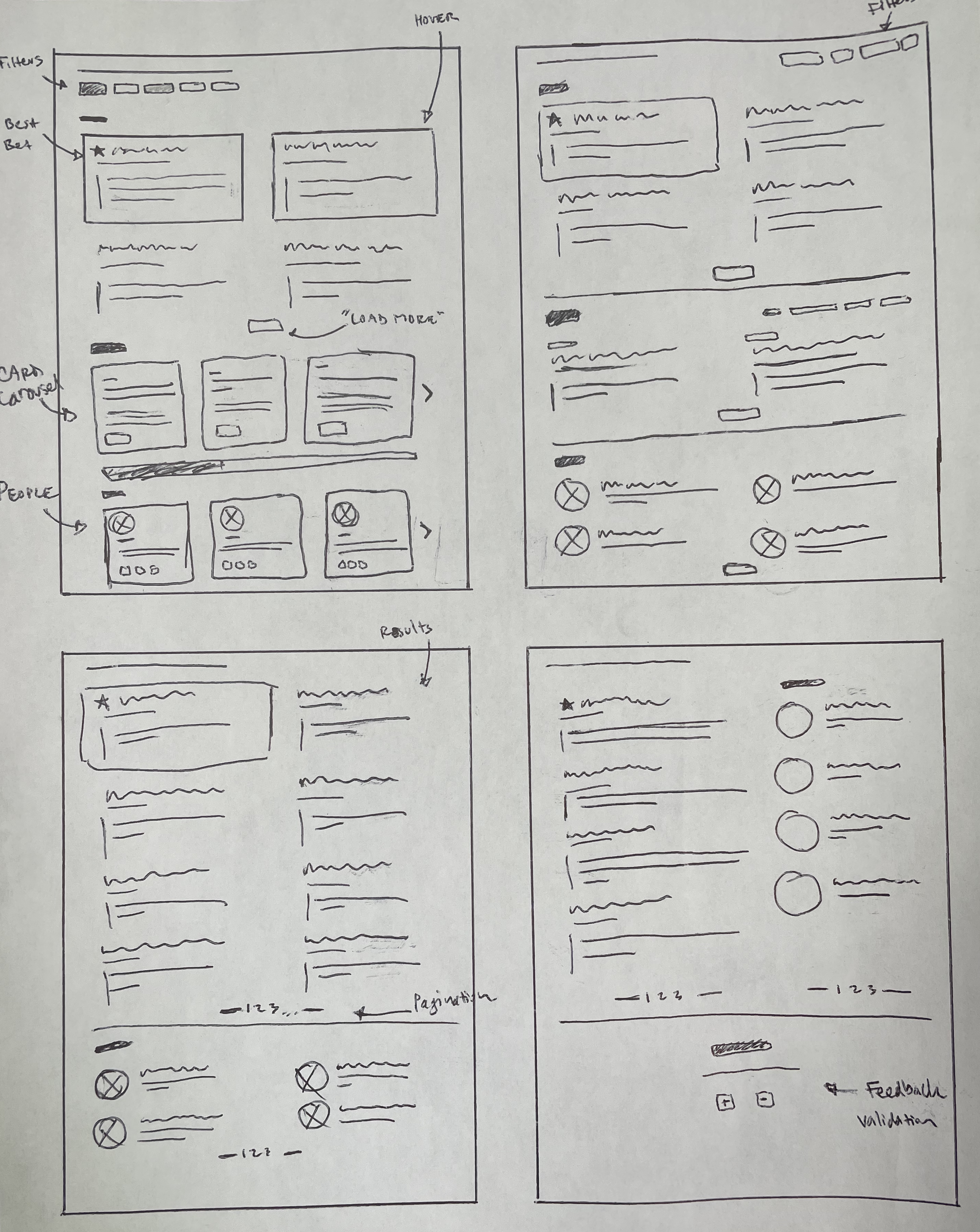
In early sketches, I attempted to discover how the layout of content will be presented to the user upon entering keywords. Did we want to add filtering capabilities? Pagination or “Load More” options? Should we fall back on our overused card styles or was this a way to lean on new designs? How many results do we want to display? Do we go below the fold with a stacked layout or should we balance it into two columns? Do we want to include a feedback area and capture customer data on the spot?
Option 1: Stacked
Option 2: Side by Side
Functionality
We knew page load time was a factor for our users, so instead of loading a search page where the results will be viewed. I wanted to build an overlay style display that will react immediately upon clicking the search icon in the navigation bar. This idea solved for several challenges we encountered, increased page load time and less clicks. The search experience functioned like a modal, if the user decided not to click any of the links in the results, they would just close the overlay and remain on the page they were already on.
The search bar as well was enhanced to display on a delay after a minimum of 5 characters were typed into the search area. This created a more responsive experience for the user, displaying immediate results helps the user interact quicker.
Prototypes
After narrowing down our designs to two versions, one stacked and the other side by side, I created interactive prototypes in Figma. Both options, although seemingly insignificant, had valid pros and cons.
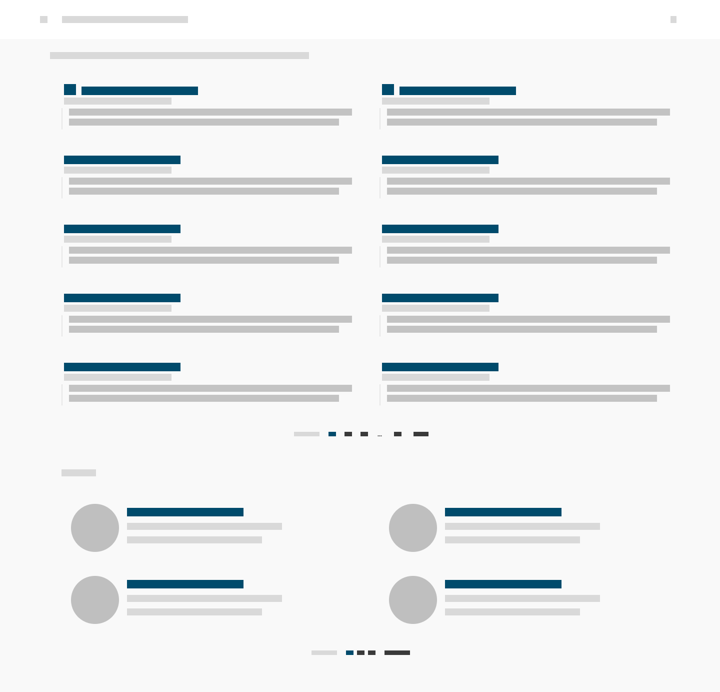
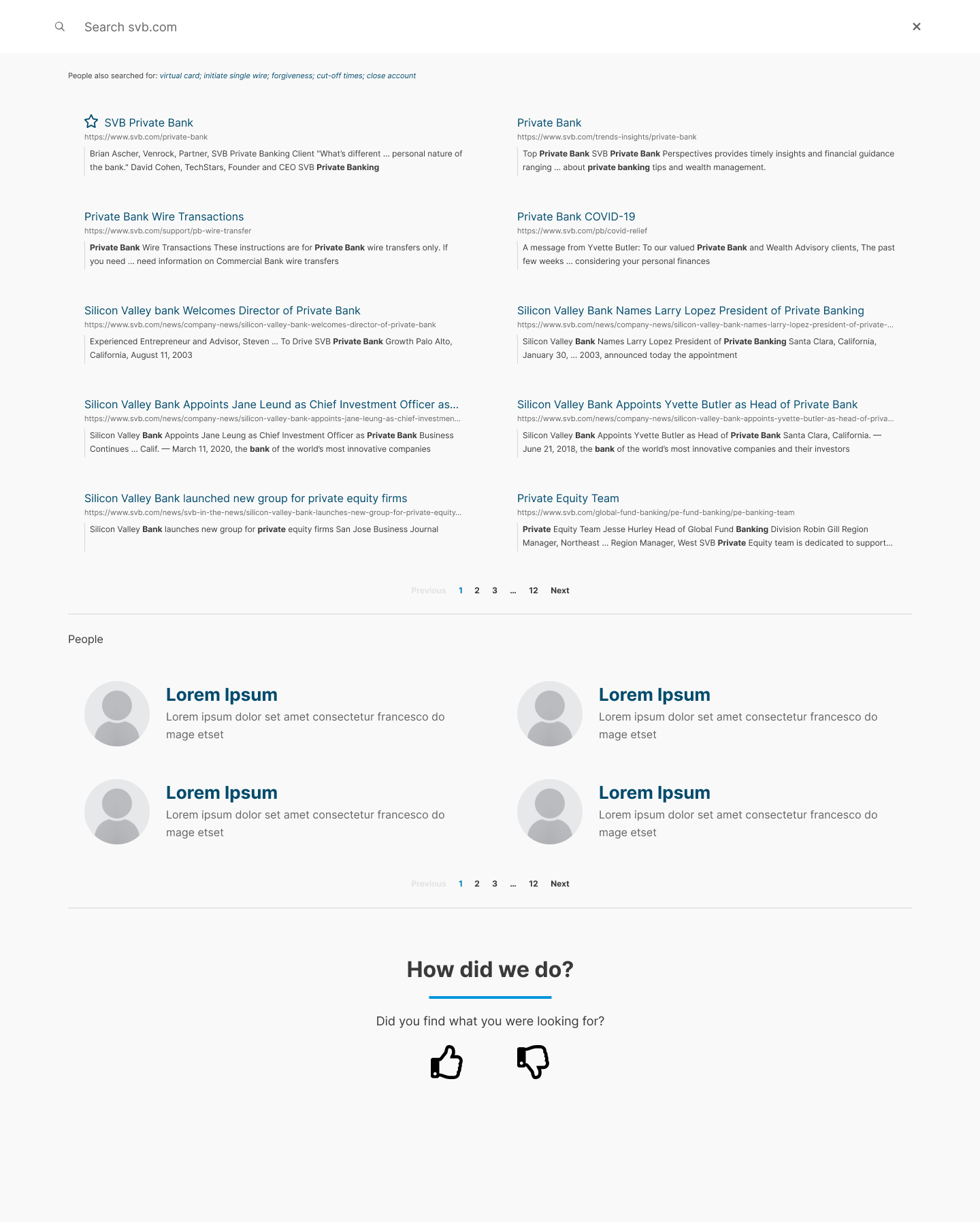
Option 1 displayed double the amount of results, adding more content to the list for relevant blogs, product pages, and services. The people section was still present, but was set below the fold. Each content area had their own pagination.
Option 1: Stacked Layout
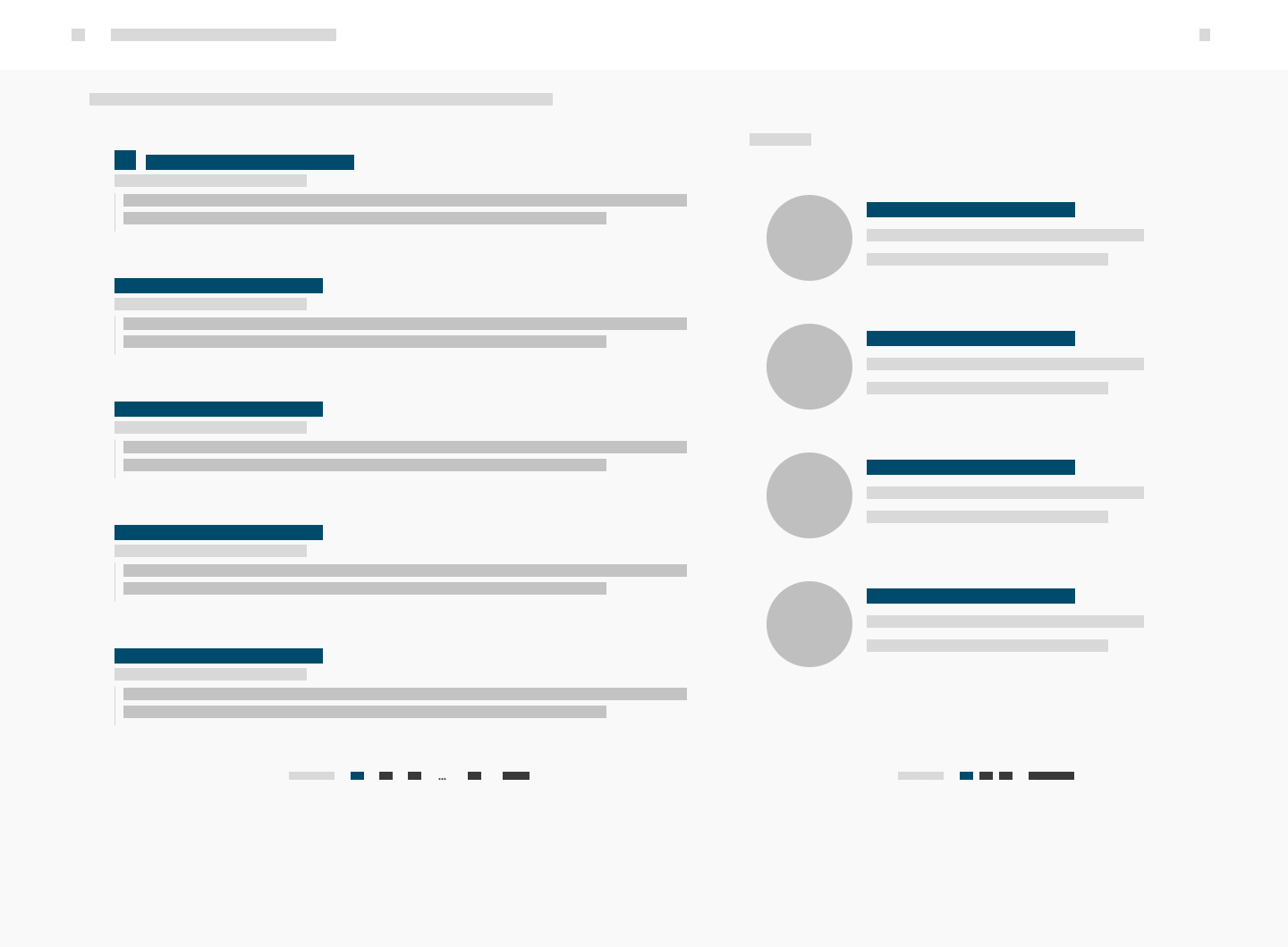
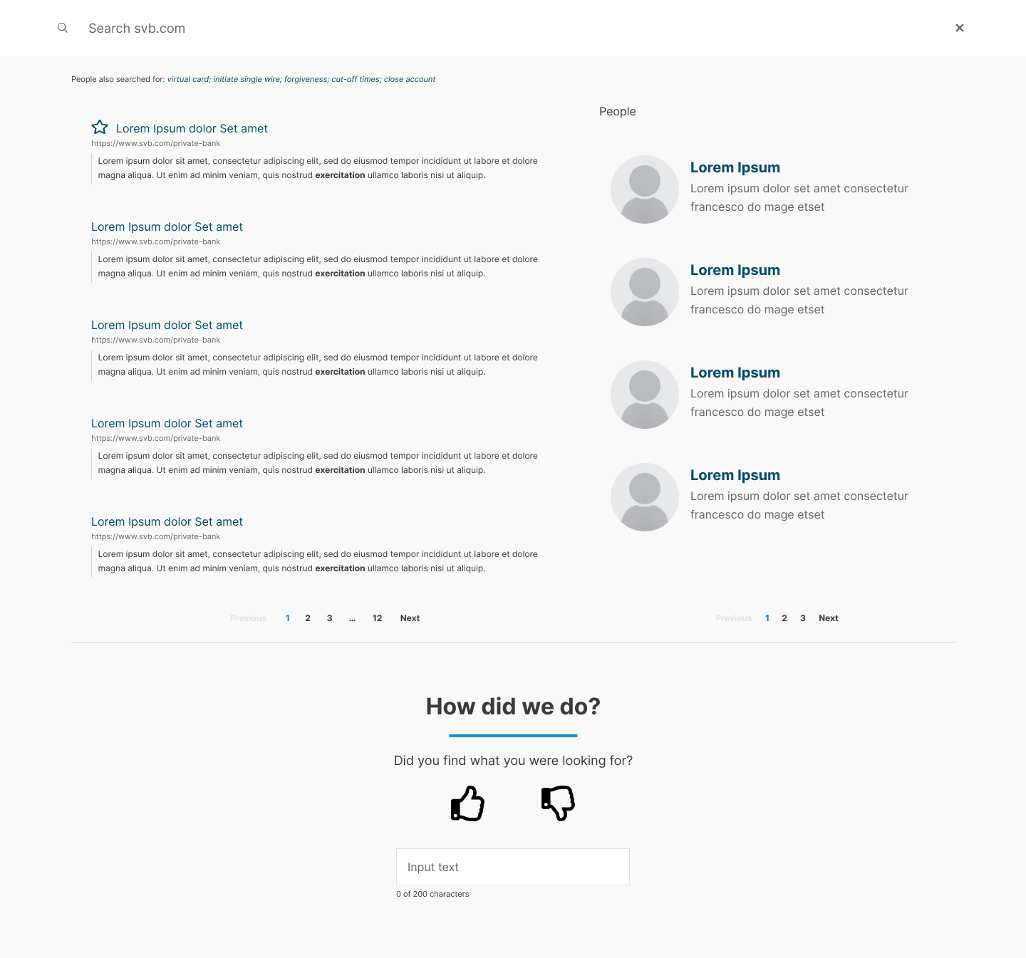
Option 2 would only display the 5 most relevant options as well as the 4 most relevant profiles along the sidebar. Although this option will show less results, all of the content will be above the fold and in an easily scannable layout. Plus, our research indicated many users used the search experience to find the profiles of authors who have written blogs, insights, and reports.
Option 2: Two Column Layout
Results
The results for the svb.com site search enhancement project was a resounding success. Praised by stakeholders, partners, and clients. We successfully listened to what the clients were struggling with and delivered a product that delivered. We A/B tested two versions, one with filters at the top and one without. We learned that the majority of users never interacted with the filters, our keyword search was powerful and accurate enough to deliver the best results.
The post research data revealed that our users were interacting with the results for both content and profiles at a staggeringly high rate. Rarely were we seeing users interact with the pagination, because the top results are accurate enough for them.
Impact and Outcome Key Takeaways
The new design serves the user intent by enabling easier search refinements
- The new design allows users to refine their searches quickly as they can see the search bar and results in the same screen
- With an easier search, the exits on the search page have dropped by 42%
- The number of clicks on the search result pages have also increased by 24% indicating a better search experience